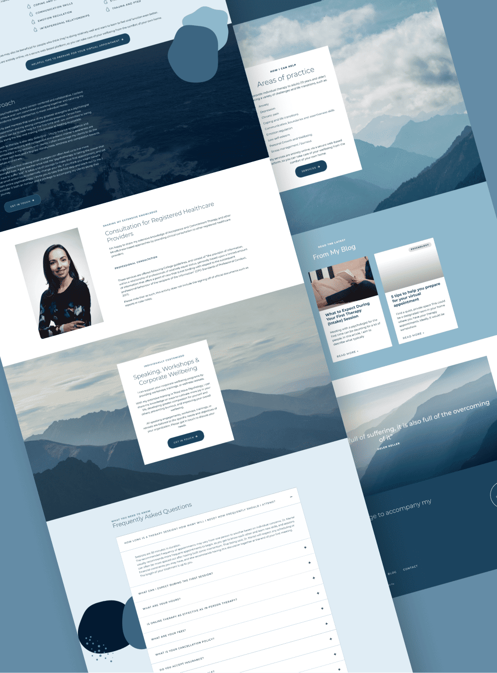
A healthcare website design checklist is a structured way to confirm your practice website has the pages, content, and user experience patients need to feel safe, informed, and ready to contact you. In healthcare, “conversion” isn’t about hype, it’s about trust. Your website should lower uncertainty and help the right people take the next step without making them work for it.
If you’re booked and busy, this matters even more: a well-built website doesn’t just get inquiries. It helps you get better-fit inquiries and fewer “quick question??” emails that go nowhere.
Key takeaways
- Your website is part of your client’s nervous system regulation. Calm layout, clear navigation, and predictable structure help people feel safe enough to reach out.
- Healthcare conversion = clarity + trust + boundaries. The goal is the right inquiry from the right person, not more noise.
- The “must-have pages” are not optional. Missing pages create doubt, and doubt kills inquiries.
- Accessibility is professionalism. Readability, contrast, headings, and alt text support patients and strengthen UX for everyone.
- Premium web design filters for premium clients. Clear process, strong positioning, and intentional copy repel price shoppers and misaligned inquiries.
Why healthcare websites are different (and why “pretty” isn’t enough)
Healthcare websites carry more emotional weight than most service sites. Visitors often arrive stressed, overwhelmed, or unsure how to ask for help. A high-performing healthcare website doesn’t push, it guides.
That means your design choices matter in a practical way: readable typography, calm spacing, clear headings, predictable page layouts, and a contact path that feels safe. A site can look modern and still convert poorly if it’s vague, cluttered, or makes people guess what happens next.
The must-have pages for a healthcare or therapy website (and what each one should do)
If you want your website to convert consistently, you need a structure that matches how patients decide.
Home page (orientation and reassurance) This page should quickly answer: who you help, what you help with, where you’re located (or whether you’re virtual), and what to do next.
About page (credibility + human fit) Patients are looking for professionalism and relational fit. Your about page should balance credentials with approach: what it’s like to work with you, what you value, and who tends to feel at home in your practice.
Services page (clarity, not a menu) Avoid a long list of modalities with no explanation. Instead, describe the problems you help with, who it’s for, and what outcomes/support can look like.
Specialty or “Areas I Help With” pages (specificity = trust) These pages often drive the best-fit inquiries because they let people self-identify. If you serve multiple niches (anxiety, burnout, postpartum, couples, trauma support, etc.), separate pages can help, when they’re written with care and not stuffed with keywords.
Fees / Insurance / Coverage page (boundary + transparency) You don’t have to publish pricing if you don’t want to, but you do need to explain how fees work, whether you provide receipts, and what patients can expect.
FAQ page (reduce friction before contact) People want to know: how to start, what the first session looks like, cancellation policy, confidentiality basics, and whether you’re the right fit.
Contact page (safe, simple next step) Your contact page should feel easy and predictable. Use plain language, set expectations, and keep the form short enough that it doesn’t feel like intake.
Policies page (professionalism + clarity) This can include confidentiality notes (at a high level), crisis resources language (appropriate to your scope), cancellations, and boundaries around response times.
What Healthcare Professionals Need to Know Before Building Their Healthcare Website
The trust signals patients look for (and where to place them)
Trust signals shouldn’t be buried. They should appear where patients naturally look for reassurance.
Include and place intentionally: credentials and registrations, professional associations, service area (Ottawa/Ottawa Valley and/or virtual regions you serve), a short “what working together is like” process, testimonials only if they’re ethically appropriate in your context, and clear boundaries (response times, emergencies, and where to go in crisis).
Trust is also built through consistency: consistent tone, consistent page layouts, and no broken buttons, missing images, or outdated information. A site that feels neglected makes people worry your practice might be hard to reach.
Healthcare website UX that improves inquiries (without feeling salesy)
Healthcare UX is about reducing cognitive load.
Use clear navigation labels (“Services,” “About,” “Fees,” “Contact”), avoid clever menu names, and make sure every page has one obvious next step. Keep pages scannable with short paragraphs, descriptive headings, and predictable section order.
Your CTAs should be calm and direct: “Book a consultation,” “Request an appointment,” or “Contact the clinic.” Avoid “Buy now” energy, it doesn’t match the context or the emotional state of the visitor.
Accessibility basics (the quiet upgrade that helps everyone)
Accessibility is not just a compliance checkbox, it’s usability.
At minimum, make sure: text has strong contrast, fonts are readable, headings are in a logical hierarchy, links are descriptive, images have alt text, and pages work well on mobile. Avoid tiny text over busy photos. Avoid motion effects that distract or trigger discomfort. Make buttons and form fields easy to tap.
This also supports SEO and overall site quality because search engines and real humans both prefer clear structure.
SEO for healthcare websites (keep it simple and local)
You don’t need a complicated SEO strategy to benefit from basic on-page structure.
Use one clear primary topic per page, write headings that match what patients actually search (“therapy for anxiety,” “burnout support,” “couples counselling in Ottawa”), and ensure your location/service area is obvious on key pages. Make sure your site is indexable, loads quickly, and doesn’t have broken links or uncompressed images slowing things down.
The goal is not to “game Google.” The goal is to be findable when the right person searches for help.
The premium filter: how your website attracts aligned patients (and fewer bad-fit inquiries)
A premium healthcare website doesn’t just attract more inquiries, it improves the quality of inquiries.
Specificity filters. Clear process filters. Calm, confident copy filters. So does a website that looks cared for. When your website communicates that you’re professional, structured, and intentional, you naturally repel people who want rushed, cheap, or boundaryless support.
That’s a good thing. Your website should protect your energy, not drain it.
FAQ section
What pages should a therapist or healthcare professional have on their website?
At minimum: Home, About, Services, Fees/Insurance info, FAQ, Contact, and Policies. Specialty pages can help if they’re written clearly and ethically.
Do healthcare websites need accessibility work?
Yes. Accessibility basics like contrast, readable fonts, proper headings, and alt text improve usability for patients and strengthen overall site quality.
Should I put pricing on my healthcare website?
Not always, but you should explain how fees work, whether receipts are provided, and what patients can expect. Clear expectations reduce friction and improve inquiry quality.
How do I get fewer bad-fit inquiries?
Be specific about who you help, what you do, what the process looks like, and what boundaries exist. Clarity filters better than vague “contact me” copy.
Is WordPress a good platform for private practice websites?
Yes, WordPress can be an excellent platform when the site is built with clean structure, mobile usability, and maintainability in mind.
If you want a healthcare website that feels calm, professional, and easy for the right patients to use, start here: Web Design & Development.
If you’d like to see examples of the style and build quality I aim for, visit the Portfolio. When you’re ready to talk through a build or redesign, use the Contact page.
By Tara-Lynn | GoWithFlo | WordPress Web Designer