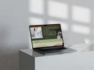
A wedding vendor website that gets inquiries is a site that does two jobs at the same time: it showcases your work beautifully and makes it obvious who you’re for, what you offer, and how to take the next step. It’s portfolio-first, yes, but it’s not portfolio-only. Because pretty photos don’t book weddings. Clarity does.
If your site is getting traffic but not inquiries (or mostly “what are your prices??” messages from people who were never going to book you), it’s usually not your talent. It’s your structure.
Key takeaways
- Portfolio-first doesn’t mean “let’s make people hunt.” A converting wedding website has guided pathways from galleries to services to contact.
- The goal isn’t more inquiries, it’s better inquiries. Your website should pre-qualify people before they ever hit submit.
- Most wedding vendor sites leak leads on mobile. If galleries are slow, text is tiny, and CTAs are missing, people bounce fast.
- Your service page is your silent salesperson. It should answer the questions people are nervous to ask and set expectations calmly.
- A premium website doesn’t attract everyone. It attracts the right couples (and politely repels chaos + bargain hunting).
Why wedding vendor websites need a different structure than “normal” service sites
Wedding clients browse differently. They’re visual-first, decision-fatigued, and comparing multiple vendors in a short time window. Your website needs to help them do three things quickly: feel something (your style), understand something (your offer), and decide something (next step).
That means your website can’t be “just a gallery.” It needs conversion points built into the browsing flow so people don’t get lost in a pretty scroll and then… disappear.
The non-negotiable pages for a wedding vendor website (and what each page should do)
A high-performing wedding vendor site usually includes:
- Home (your positioning + strongest work + clear next step) This isn’t the place to list every possible service. It’s the place to help the right people think, “This is the vibe, and this is the vendor.”
- Portfolio / Galleries (organized like a buyer’s brain, not your hard drive) Group work by the way couples search: full weddings, engagement, editorial, venues, seasons, styles, whatever fits your niche.
- Services (the “how it works” and the “what you get” page) This page is where inquiries are won or lost. It needs clarity, process, and boundaries.
- About (connection + credibility, not a memoir) In weddings, fit matters. Your about page should make it easier to choose you, not harder.
- Contact (simple, clear, and designed to pre-qualify) A contact form should reduce back-and-forth, not create it. Ask only what you need to respond well.
- FAQ (remove friction and cut down “quick questions”) Common questions should be answered calmly, with confidence.
- Optional but powerful: Case studies / Featured weddings A “featured wedding” post that shows the full story plus outcomes is proof that feels real.
Portfolio-first structure that still converts (without feeling salesy)
A portfolio can be conversion-friendly without becoming pushy. The trick is placing CTAs where people are already convinced.
Good CTA placements include: after a full wedding gallery, under a short “If you’re into this style…” block, at the end of your services section, and in your site header.
Your CTA copy should match the tone of wedding clients. Think: “Check availability,” “Inquire about your date,” “Start here,” or “Contact me.” Not “BUY NOW” energy. We’re not selling a toaster.
The service page checklist that upgrades inquiry quality
If you want fewer price shoppers, your service page needs to do more than list packages.
Include: who you’re best for, what you’re known for, your process (high-level), what’s included (clear and concise), a starting point or investment framing (even if you don’t list full pricing), boundaries (travel, hours, response times), and what happens after inquiry.
A strong service page also uses real language couples use. Not industry jargon. Not vague “bespoke experience” paragraphs that say nothing. (If your page could be copied and pasted onto any photographer’s website, we need to rewrite it.)
The #1 conversion leak: slow galleries and heavy images
Wedding sites are image-heavy. That’s normal. But if your site loads slowly, couples won’t wait.
Common culprits include: massive uncompressed images, too many sliders, autoplay video, and fancy effects that look cool but slow everything down, especially on mobile.
A premium site should feel fast and smooth. Not because we love performance metrics for fun (though… some of us do). Because speed is part of the client experience.
If you want a broader “small fixes” companion post, link here: How to Optimize Your Website Without a Full Redesign: A Practical Guide for Service-Based Businesses.
Mobile UX for wedding vendors: where most sites quietly fail
Most wedding browsing happens on phones. If your site looks gorgeous on desktop but clunky on mobile, you’re losing leads.
Mobile priorities: readable font sizes, tappable buttons, no text over busy images, galleries that don’t take forever to load, and a contact CTA that’s easy to find from any page. Your navigation should be obvious, not cute.
A quick gut check: can someone figure out your style, your offer, and how to contact you within 60 seconds on their phone? If not, we tighten the structure.
The “premium filter”: how to attract aligned couples and repel chaos inquiries
The best wedding vendor websites create a feeling: calm, confident, intentional.
They filter with: clear positioning, confident language, clear process, and a contact form that asks the right questions. They also don’t over-explain or apologize. Premium clients don’t need to be convinced with 17 paragraphs. They need clarity and proof.
If you’re not sure what to prep before investing in a higher-performing site (so the project goes smoothly and you get the result you want), link here: What to Have Ready Before Hiring a Web Designer.
If you want a wedding vendor website that showcases your work and helps the right couples inquire, start here: Web Design & Development.
Want to see what this looks like in real life? Browse the Portfolio. When you’re ready to talk dates, goals, and a build that fits your brand, use the Contact page.
FAQ
What pages should a wedding vendor website have?
At minimum: Home, Portfolio/Galleries, Services, Contact, and a FAQ area. Featured weddings or case studies can be a strong upgrade for trust.
Should I list my pricing on my wedding website?
You don’t have to list full pricing, but you should include investment framing (starting-at, minimums, or “most clients invest…”) so you attract more aligned inquiries.
Why am I getting traffic but not inquiries?
Common reasons include unclear service messaging, missing CTAs on portfolio pages, slow galleries, weak mobile UX, and a contact form that’s hard to find or too demanding.
How do I get fewer “just wondering your prices” inquiries?
Use clear positioning, a strong service page, investment framing, and a contact form that pre-qualifies (date, location, venue, type of coverage, etc.).
Is WordPress good for wedding vendor websites?
Yes, WordPress works very well for wedding vendors when the site is built with strong structure, image optimization, mobile-first design, and easy maintenance.
By Tara-Lynn | GoWithFlo | WordPress Web Designer (7+ years of Elementor experience)