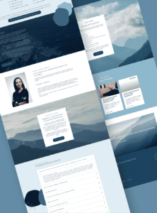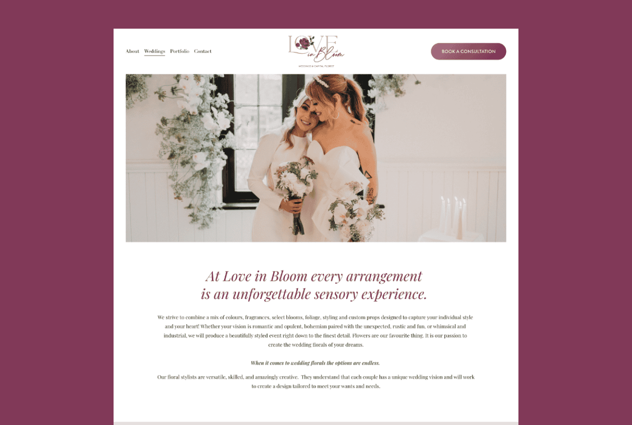
A high-converting services page is a page that helps the right people understand what you do, see themselves in it, trust your credibility, and take the next step, without a 12-email back-and-forth. It doesn’t “convince” everyone. It filters. It pre-sells. It makes your business feel easier to choose.
If your site is getting traffic but your inbox is filled with vague “how much??” messages (or nothing at all), your services page is often the quiet culprit.
Key takeaways
- Your services page is the decision page. For most service businesses, it matters more than your homepage.
- Clarity is what converts. Not clever writing, not trendy layouts, not “luxury” fonts.
- A good services page reduces admin. It answers common questions and sets expectations upfront.
- High-paying clients look for structure. They want to understand your process, your boundaries, and what working together looks like.
- The best services pages repel bad-fit leads. If your page is too broad, it will attract everyone, including the people you don’t want.
Why your services page matters more than you think
Most visitors don’t land on your homepage, read every word, then slowly fall in love with your brand story.
They click around like normal humans with limited patience.
If they’re interested, they look for the page that answers: “Okay, but what do you actually do for people like me?” That page is your services page.
A strong services page creates momentum. A weak one creates friction: uncertainty, confusion, and “I’ll think about it” energy.
What a services page is (and what it is not)
A services page is not a list of everything you’ve ever offered. It’s not a “menu.” It’s not a dumping ground for jargon. And it’s not the place for vague, fluffy paragraphs that could belong to any business on the internet.
A services page is a guided decision path.
It should help a visitor quickly confirm fit, understand outcomes, feel trust, and know what to do next.
If your services page could be summarized as “I help people with things,” it needs a rewrite.
The #1 services page mistake: describing tasks instead of outcomes
A lot of service pages read like: “I offer strategy sessions, implementation, support, consultation, and more.”
That’s tasks.
High-paying clients are looking for outcomes, transformation, relief, and a clear use case. They want to know what changes because they hired you.
Better messaging sounds like: “We’ll build a WordPress website that makes it obvious what you do, loads fast on mobile, and turns the right visitors into inquiries.”
That’s not hype. That’s a result.
The high-converting services page structure (use this exact order)
If your visitor is scanning, this order helps them stay oriented.
1) Clear positioning headline One sentence that says who it’s for and what it does. Keep it human. Keep it direct.
2) A short “what this solves” section Name the pain your ideal client actually feels. Not generic pain. Real pain.
3) Your services (organized by decision, not by you) If you have multiple offers, group them in the way people choose. If you have one offer, go deeper.
4) Proof in the middle (where people start doubting) People doubt halfway down the page. Put proof where doubt shows up.
5) Your process (high level, calm, clear) High-paying clients want to know what happens after “yes.”
6) Investment framing (without turning your site into a price war) You don’t have to publish pricing, but you should set expectations so you don’t attract the wrong crowd.
7) One clear CTA (repeated calmly) Make the next step obvious.
8) FAQ (objections + logistics) Answer the questions that keep people from clicking.
How to write your positioning headline (without sounding like everyone else)
A positioning headline is not a slogan. It’s a sorting hat.
Good formulas (choose one and keep it simple):
- “WordPress web design for [audience] who want [result].”
- “A [type of website] built for [type of business] to [desired outcome].”
- “For [ideal client], I build [service] that [result], without [common frustration].”
If you want to attract higher-paying clients, avoid vague universals like “for everyone” or “for all entrepreneurs.” Premium buyers expect specificity.
Proof that actually supports conversion (not just compliments)
Testimonials are helpful, but “She was amazing!” isn’t doing much on its own.
High-converting proof answers: What was the problem? What changed? What was the experience like? What was the outcome?
Proof can include: short case snapshots, portfolio examples, specific testimonials, and “what clients typically see” statements (kept honest and grounded).
If you have a portfolio, link it from the services page (and don’t hide it in the footer).
You can send people to your portfolio here: Portfolio.
The process section: where high-paying clients decide you’re safe
A good process section lowers anxiety.
It says: “Here’s what happens next. Here’s what you need from me. Here’s what I handle. Here’s the timeline.”
This is where you quietly repel clients who want rushed timelines, no collaboration, or endless revisions. Clear process is a boundary.
If your current website projects feel chaotic, you’ll like this post too: What to Have Ready Before Hiring a Web Designer.
Pricing language that filters (without listing every number)
You don’t have to post your full pricing to filter. You just need investment framing.
Examples of filtering language that stays calm:
- “Projects typically start at…”
- “Most clients invest…”
- “This is best for businesses ready to…”
- “If you’re looking for the cheapest option, this probably isn’t the right fit.”
The goal is not to shame people. The goal is to prevent misalignment.
If you want a deeper read on how website investment works, you can link to: Decoding Website Costs: Your Comprehensive Guide to Online Presence.
SEO basics for your services page (so the right people can find it)
Your services page should be written for humans first, but it still needs basic SEO structure.
That means: one clear primary topic, descriptive headings, internal links to relevant pages (portfolio, contact), and a page title/meta description that match what people actually search.
Also: your site needs to be technically healthy, headings in order, images optimized, minimal layout jumps, and mobile-friendly design.
If you want a practical “fix what you can without rebuilding everything” guide, link here: How to Optimize Your Website Without a Full Redesign: A Practical Guide for Service-Based Businesses.
The premium filter checklist (use this to attract better inquiries)
A premium services page usually has:
Clear niche or audience language, clear outcomes, a calm confident tone, proof that feels real, a defined process, boundaries, and a contact path that’s easy.
A non-premium services page usually has:
Vague copy, unclear offers, too many CTAs, no proof, no process, and a contact form hidden like an Easter egg.
If you’re getting bad-fit inquiries, your services page is the first place to tighten.
FAQ
What should be on a services page?
A strong services page includes: a clear positioning headline, who it’s for, what it solves, what’s included, proof (portfolio/testimonials), your process, investment framing, a clear CTA, and an FAQ.
How long should a services page be?
Long enough to answer real decision questions without feeling bloated. For high-ticket services, longer pages often convert better because they reduce uncertainty.
Why am I getting inquiries that don’t fit my services?
Usually because the services page is too broad, unclear, or missing boundaries/process language. Tightening positioning and adding filtering statements helps fast.
Can I improve my services page without redesigning my whole website?
Yes. Updating services page structure, CTAs, proof placement, and copy clarity can improve conversions without a full rebuild.
If you want a services page (and a website) that attracts better-fit inquiries and saves you from constant explaining, start here: Web Design & Development.
To see examples of finished builds, visit the Portfolio. When you’re ready to talk through your site and what it needs next, use the Contact page.
You can also browse more practical posts on the Blog.
By Tara-Lynn | GoWithFlo | WordPress Web Designer