This post covers entities and concepts related to high-converting WordPress web design for service businesses, including: WordPress (CMS), Elementor (page builder), website information architecture (IA), user experience (UX), user interface (UI), conversion rate optimization (CRO), calls to action (CTAs), service pages, contact forms, lead capture, trust signals (testimonials, credentials, portfolio/case studies), mobile responsiveness, Core Web Vitals and site speed, accessibility (WCAG principles, contrast, alt text, semantic headings), on-page SEO (title tags, meta descriptions, internal linking, image optimization), local intent (Ottawa/Ottawa Valley searches), and content strategy for service-based businesses.
A high-converting service business website is a website that consistently turns the right visitors into real inquiries by making it easy to understand what you do, who it’s for, why you’re credible, and what to do next. It’s not a “marketing funnel” in a trench coat. It’s a clear, calm path from “I think you might be my person” to “Yes, I want to work with you.”
And if your site looks fine but inquiries are inconsistent, slow, or low-quality, that’s usually not a motivation problem. It’s a structure problem.
Key Takeaways
- “High-converting” doesn’t mean “pushy.” It means your site answers the real questions your ideal client is already thinking, in the right order, without making them dig.
- Design is not decoration. Your layout, copy, and navigation either reduce decision fatigue… or quietly create it.
- Most websites don’t need “more traffic” first. They need to stop leaking the traffic they already have through unclear services, weak CTAs, and broken trust-building.
- WordPress can absolutely be clean, fast, and easy to manage when it’s built with the right structure and not weighed down by messy installs and random add-ons.
- A premium website is a business asset. If you’re established and your work is real, your site should reflect that, so you’re not attracting bargain hunters and ghost inquiries.
What “conversion” means for a service business (hint: it’s not always a purchase)
For e-commerce, conversion is often “buy now.” For a service business, conversion is usually one of these: a consultation request, a contact form submission, a booking, a waitlist signup, or an email inquiry that’s actually serious.
So a high-converting site doesn’t just “look professional.” It reduces uncertainty. It helps your ideal client quickly confirm three things: “You can help me,” “I trust you,” and “I know what to do next.”
If your site isn’t doing that, people don’t necessarily leave because they hate your work. They leave because they’re busy, slightly unsure, and your website didn’t make the decision easy.
The real job of your homepage: orientation, not autobiography
Your homepage isn’t your life story. It’s orientation.
A homepage that converts does a few very specific jobs fast: it states what you do, who you help, what result you’re known for, and where to click next. Then it supports that message with trust signals and clear routes to deeper pages.
If your homepage is trying to be a homepage, an about page, a services page, and a blog archive all at once, it usually ends up doing none of them well. It becomes a scroll museum.
A cleaner approach is: a strong headline, a short supporting line, then a few intentional sections that guide people into the pages that actually convert, your services and your contact path.GIF callout: Add a short GIF showing a “before/after” homepage scroll: cluttered vs clean sectioning. Alt text: “Homepage layout before and after: cluttered sections vs clear conversion sections.”
The 7 elements every high-converting service business website needs
This is the part most people skip because it’s not as fun as fonts. But it’s the part that gets you inquiries.
- 1) Clear positioning (in normal human words) You don’t need clever. You need clear. If your visitor can’t repeat what you do after five seconds, conversion drops.
- A service structure that matches how clients choose Most service businesses have tiers, packages, or at least a “here’s how we work” process. Your site should mirror the decision-making path, not your internal brain map.
- Proof that feels real (not vague) Testimonials are good. Specific testimonials are better. Case studies or portfolio examples help people self-select quickly.
- Trust signals where people actually look for them Credentials, associations, years of experience, media features, location, approach, boundaries, these belong in predictable spots. Don’t hide them three clicks deep.
- A single primary CTA per page Pick one main action. Not five. Not “book / call / email / DM / download / subscribe” all at once. Calm websites make one next step feel obvious.
- A fast, mobile-first experience Most of your audience is on their phone, in between appointments, errands, or life. If your site loads slowly, jumps around, or is hard to tap, you’re losing leads before they even meet you.
- Accessibility basics (because professionalism includes access) Good headings, readable contrast, alt text, and clean link labels help everyone, and they also support SEO and usability. This is part of “high quality,” not an optional upgrade. Image callout: Insert a screenshot-style graphic: “7 Elements Checklist” with simple icons. Alt text: “Checklist of 7 elements of a high-converting WordPress service business website.”
Why your website might look “fine” but still convert poorly
This is where a lot of established business owners get stuck: the site isn’t broken. It’s just not doing its job.
Common conversion leaks include: unclear service pages, missing CTAs, weak internal linking, slow load times (often from uncompressed images), confusing navigation labels, and contact forms that are buried, broken, or too complicated.
Sometimes it’s also a mismatch problem. If your copy is too broad (“I help everyone”), you’ll attract everyone, including the people you don’t want. A high-converting site isn’t only about getting more inquiries. It’s also about getting better ones.
If you want a good starting point for “small fixes before a full rebuild,” this post pairs well with: How to Optimize Your Website Without a Full Redesign: A Practical Guide for Service-Based Businesses.
WordPress design that converts is mostly structure (and a little bit sparkle)
WordPress gets blamed for a lot of things that are actually “site setup” problems.
A high-converting WordPress website usually has: clean page templates, consistent spacing and typography, a navigation that reflects your core decision pages, and a build that doesn’t rely on thirty plugins to do basic tasks.
If you’re using a builder like Elementor, the goal is still the same: create a stable, responsive layout system you can actually maintain without fear-clicking your way through updates.
And yes, your website can be beautiful. We’re just not letting beauty be the only plan.
The “premium client” filter: how high-converting sites repel bad-fit inquiries
If you’re established, you don’t need your website to appeal to everyone. You need it to resonate with the right people.
High-quality websites filter in a few ways: they’re specific about who they help, they’re clear about the process, they show confident pricing language without listing numbers (“investment,” “projects,” “availability”), and they don’t position the service as a commodity.
They also avoid DIY bait content that attracts the wrong audience. If your goal is premium web design clients, your content and pages should communicate: “This is done with care, strategy, and standards.”
That’s how your site becomes a boundary, not just a brochure.
What to prepare before you invest in a high-performing website
If you’re already thinking “okay, but what do I need ready?”, good. That’s the mindset of someone who gets results.
At minimum, you’ll want: a clear offer (even if it’s evolving), a sense of your ideal client, examples of your work or outcomes, and a basic idea of your capacity (so your site can guide the right next step). You don’t need perfection. You do need clarity.
If you want a fuller checklist, you’ll like: What to Have Ready Before Hiring a Web Designer.
A “high-converting” site checklist (the version you can actually use)
Here’s the simplest way to audit your current site without spiraling:
Is it obvious what you do and who it’s for within five seconds? Is your primary CTA consistent across key pages? Do your service pages answer the real questions people ask before they reach out? Does your site work cleanly on mobile? Do you have proof that feels specific? Do pages load quickly without weird layout jumps? Is your contact path easy, visible, and trustworthy?
If you answered “no” to more than two of those, your site probably isn’t “bad.” It’s just under-structured.
| Website element | What it should do | What it looks like when it’s working |
|---|---|---|
| Homepage message | Orient the right people fast | Visitors understand your offer and click deeper within one scroll |
| Services page | Pre-sell your work | Fewer “price shoppers,” more “I read everything and I’m ready” inquiries |
| Proof | Reduce uncertainty | Testimonials/case studies that match your target client’s situation |
| CTA | Create a clear next step | One primary action per page, repeated calmly (not aggressively) |
| Mobile UX | Remove friction | Buttons are tappable, text is readable, layout doesn’t break |
| Speed | Keep people on the page | Pages load quickly; images are optimized; no janky jumps |
| Accessibility basics | Improve usability for everyone | Proper headings, contrast, alt text, descriptive links |
FAQ
What is a high-converting website for a service business?
A high-converting service business website is one that consistently turns the right visitors into inquiries by providing clear messaging, trust signals, and an obvious next step.
Do I need more traffic for my website to convert?
Not always. Many established businesses have enough traffic to get better results, but the website is leaking leads through unclear service pages, weak CTAs, or usability issues.
Is WordPress good for a service business website?
Yes. WordPress is a strong platform for service businesses when it’s set up cleanly, structured well, and built with mobile usability, speed, and maintainability in mind.
What pages matter most for conversions?
Usually: homepage, services, about (done strategically), portfolio/case studies (if relevant), and a contact path that feels easy and trustworthy.
How do I stop getting low-budget or bad-fit inquiries?
Your website should be more specific about who you help, what outcomes you’re known for, and what working together looks like. Clarity filters better than “please don’t” disclaimers.
If you want a WordPress website that looks like your brand and does its job (clarity, trust, inquiries), start here: Web Design & Development.
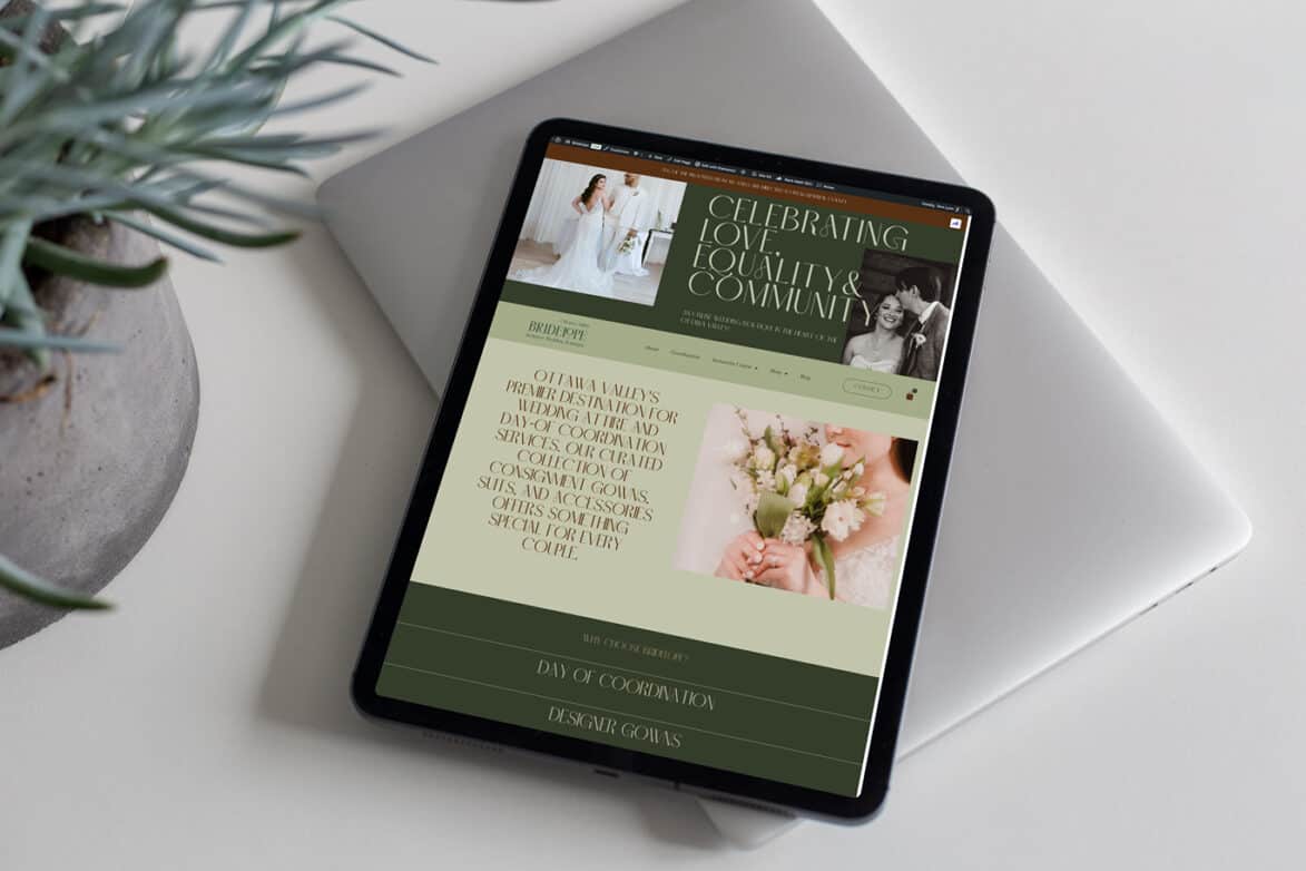
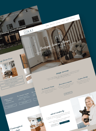
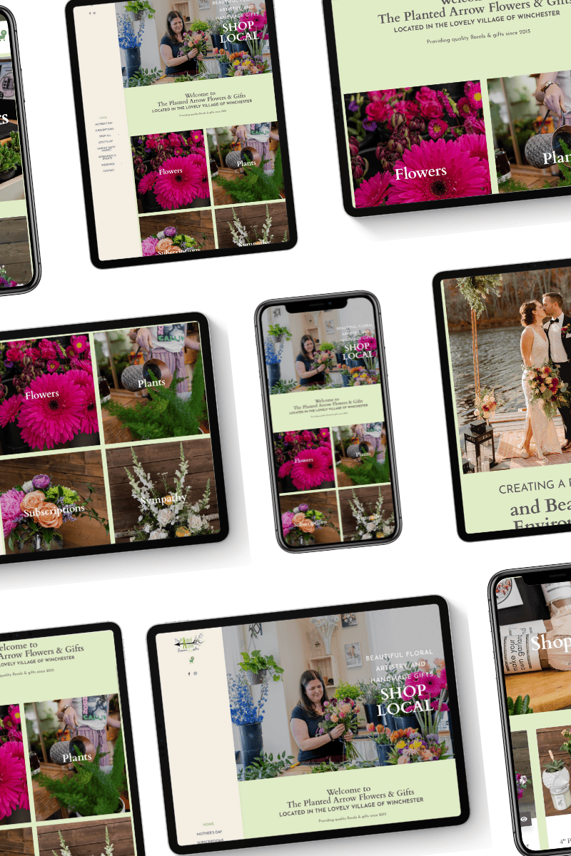
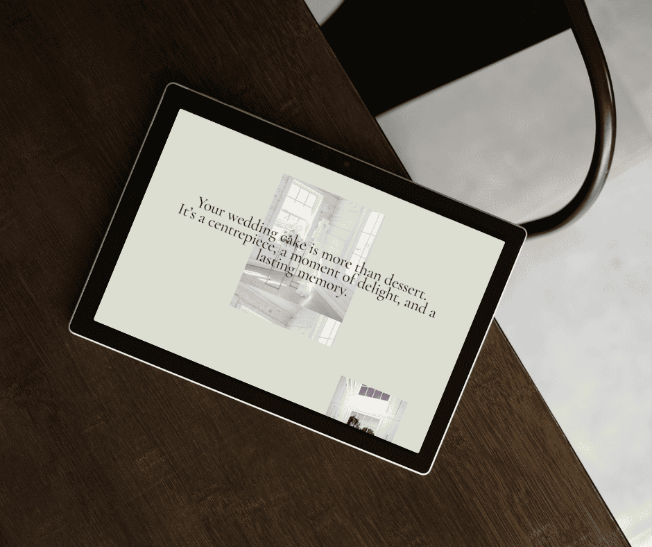
If you’d like to see examples of the kind of work I build, head to the Portfolio. When you’re ready to talk through your project, use the Contact page.
And if you’re in “research mode” (respect), you can browse the full Blog for practical website strategy posts.