Pre-selling on a coaching or consulting website means your pages do the heavy lifting before anyone books a call: they clarify your offer, build trust, answer common objections, and set expectations so the right people arrive already warmed up. Not hyped. Not “sold.” Just clear.
If your consult calls are full of explaining, justifying, or convincing, your website isn’t doing its job yet. The good news is: you don’t need a louder brand. You need a better page structure.
Key takeaways
- A coaching website should reduce “explaining energy.” If you repeat the same basics on every call, your pages are missing key pre-sell pieces.
- High-ticket clients want clarity, not complexity. Confusing offers and vague copy attract “info seekers,” not buyers.
- Your services page is the main decision page. Treat it like a conversion asset, not a menu.
- Proof needs to be specific. Outcomes, examples, and process are what build trust, not generic “life-changing” language.
- The best coaching sites filter hard. Clear boundaries, minimum engagement language, and defined fit repel bargain shoppers and misaligned leads.
What “pre-sell” actually means for coaches and consultants
For service businesses, conversion isn’t “buy now.” It’s usually: submit an inquiry, request a consult, apply, or book a call.
So “pre-sell” means your website answers the questions your ideal client is quietly asking, like: What do you actually do? Who is this for? What’s the process? Can I trust you? What results do people get? What will this require from me? What’s the investment range? And what do I do next?
If your website doesn’t answer those questions, your consult calls become a first date with no context. And that’s exhausting.
The core page stack for a coaching website that attracts qualified inquiries
You don’t need 47 pages. You need the right pages, written in the right order.
1) Homepage (orientation + immediate fit) Your homepage should quickly communicate your audience, your transformation, and the next step. It’s not the place for your entire story or every offer you’ve ever made.
2) Services page (the decision page) This is where most qualified people decide whether to reach out. If you have multiple offers, your services page should guide people to the right one with clean structure.
3) About page (credibility + why your approach works) This isn’t a biography dump. It’s a trust bridge: why you, why this approach, and what it’s like to work together.
4) Proof page (case studies / results / wins) Even if you don’t have formal case studies, you can share anonymized “before/after” scenarios, outcome patterns, and what clients typically experience.
5) Contact or Apply page (one clear next step) Your contact path should match your business model: quick inquiry form, consult booking, or application. Keep it simple and set expectations for response times and next steps.
Optional (but powerful) pages: A “Start Here” page for clarity, a FAQ page for objections, and a “Method” page if your framework is a big part of your differentiation.
Your services page: the silent salesperson (and the most common weak spot)
If I could only fix one page on a coaching website, it’s usually the services page.
A high-performing coaching services page includes: who it’s for, the problem it solves, the outcome, what’s included (at a high level), your process, how long it typically takes, what success looks like, and what it requires from the client.
It also needs one clear CTA and a calm path forward. If your services page ends with “DM me on Instagram,” you’re adding friction for the exact people you want to book.
Copy that attracts high-ticket clients (without sounding like a walking sales script)
High-ticket clients don’t need louder promises. They need specificity and a sense of safety in your delivery.
That means: concrete outcomes (even if they’re qualitative), clear boundaries, confident language, and a clear description of what working together looks like week-to-week or month-to-month.
Avoid copy that could belong to anyone. If your website says “I help you step into your power” but never explains what you actually do, you’ll attract a lot of curious browsers, and very few buyers.
A simple prompt that improves most coaching sites immediately: write one section titled “This is for you if…” and one titled “This is not for you if…”. Not rude. Just clear.
Proof that converts for coaches: what to show when you can’t share everything
Not every coach can share detailed client stories. That’s fine.
You can still build trust with: anonymized patterns (“Clients often come in with X and leave with Y”), process clarity (“Here’s how we work”), credentials and experience (in plain language), your method/framework (if relevant), and specific testimonials that focus on experience and outcomes rather than vague praise.
If you have a portfolio-style page (common for creative consultants) or case study snapshots, even better. Proof should feel real, not curated.
The premium filter: how your website repels bad-fit leads (and saves your time)
If you want high-paying clients, your website needs to act like a filter, not a megaphone.
That means being honest about minimum engagement (“best results in 3–6 months”), capacity (“limited spots”), readiness (“you’ll need to implement”), and fit (“this is for service-based business owners, not early-stage hobby projects,” or whatever matches your niche).
Premium clients appreciate clarity. Bad-fit leads dislike it, and that’s the point.
What to fix first if your website isn’t converting (without a full redesign spiral)
If your site is “fine” but consults aren’t, start with these priority fixes: clarify your headline and positioning, tighten the services page structure, add proof in a skimmable format, and make the CTA path painfully obvious.
If you want a companion read for quick wins, link here: How to Optimize Your Website Without a Full Redesign: A Practical Guide for Service-Based Businesses.
And if you’re preparing to hire a designer (or you want your next build to go smoothly), link here: What to Have Ready Before Hiring a Web Designer.
FAQ
What pages does a coaching website need?
At minimum: Homepage, Services, About, Proof (case studies/results), and Contact or Apply. A FAQ page is also a strong conversion support page or you can ensure that it’s included on each applicable page.
Should coaches have a sales page or a services page?
If you have one core offer, a sales page can work well. If you offer multiple pathways, a strong services page (plus offer detail pages) is often more usable and easier to navigate.
How do I attract higher-paying coaching clients from my website?
Use clear positioning, specific outcomes, strong proof, and boundaries like minimum engagement language and fit statements. High-ticket clients respond to clarity and confidence.
Why are my consult calls full of people who aren’t ready?
Your website may be too broad, too vague, or missing filter language. Tightening your services page and CTA path usually improves lead quality quickly.
Is WordPress good for coaching websites?
Yes. WordPress is a strong platform for coaches when the site is built with clean structure, good mobile UX, and easy content updates.
If you want a coaching website that pre-sells your work, so consult calls start with alignment instead of explaining, start here: Web Design & Development.
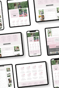
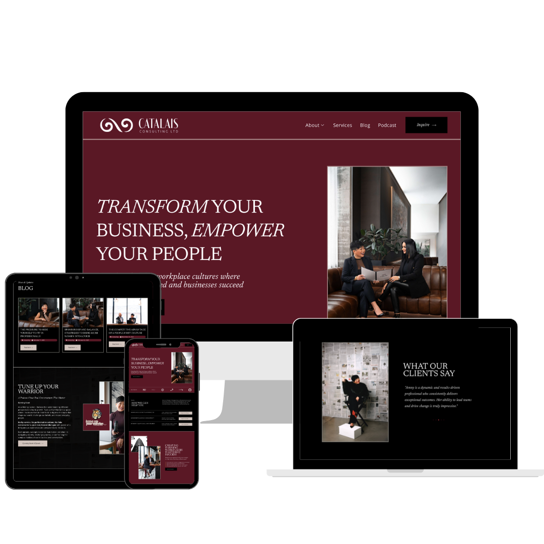
Want to see examples of polished, conversion-aware builds? Visit the Portfolio. When you’re ready to talk structure, messaging, and a WordPress site that actually supports your business, use the Contact page.
You can also browse more website strategy posts on the Blog.
By Tara-Lynn | GoWithFlo | WordPress Web Designer